A striking and fresh website redesign for a digital media company, with a nautical twist.

The brief
The goal here was to sharpen how the brand shows up in the world—giving BCi both a polished web presence and the everyday tools to maintain it. The commission spanned custom web design and build, location and portrait photography, and a practical brand kit providing graphic assets for social media and client decks.
What I did
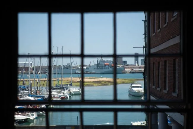
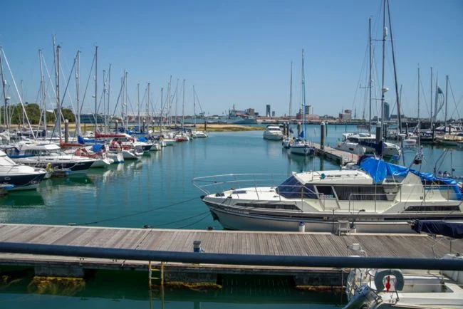
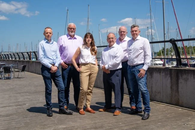
Working from their existing logo, I extended the branding to include a fresh and distinctive colour palette and graphics. I took inspiration from the nautical setting and heritage of their headquarters in Gosport (a historic industrial waterfront and former Royal Navy victualling yard). I carried out a photo shoot to capture team portraits and the beautiful office setting.
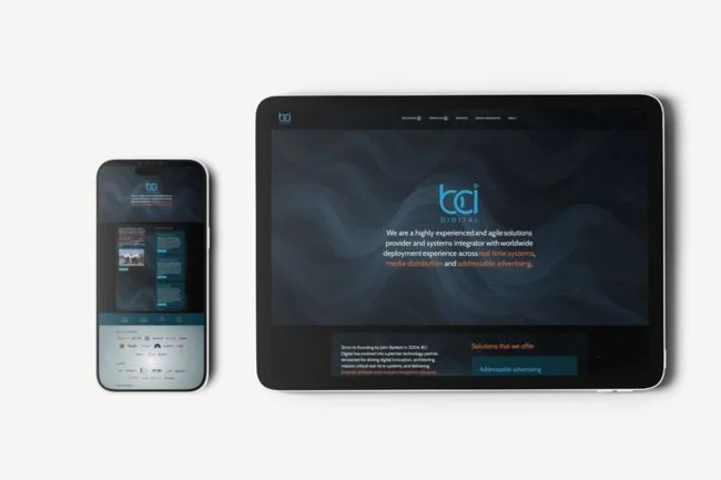
The website meets WCAG AA accessibility standards, is fully responsive (mobile and tablet friendly) and is performance and SEO-optimised.
-
#0AA7E0
BCi Digital Blue
The BCi logo colour, and the starting point for every blue in the palette.
-
#00759D
Solent Blue
A 30% shade of BCi Digital Blue.
-
#003243
Gosport Teal
A 70% shade of BCi Digital Blue.
-
#FF4F00
International Orange
The highlight colour. Used in the aerospace and maritime industries to set objects apart from their surroundings, and opposite blue on the colour wheel.
-
#CDCECE
Sea Mist
A 70% tint of Night Watch grey.
-
#595A5B
Night Watch
A dramatic dark grey that works well with both the blue and the orange.
-
#2D2D2E
Storm Force
A 50% shade of Night Watch grey: almost black, but not quite.







Have a project in mind?
A website, a photo shoot, or something in between. Tell me what you’re thinking and I’ll get back to you.