Regular Cleans
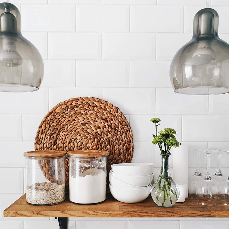
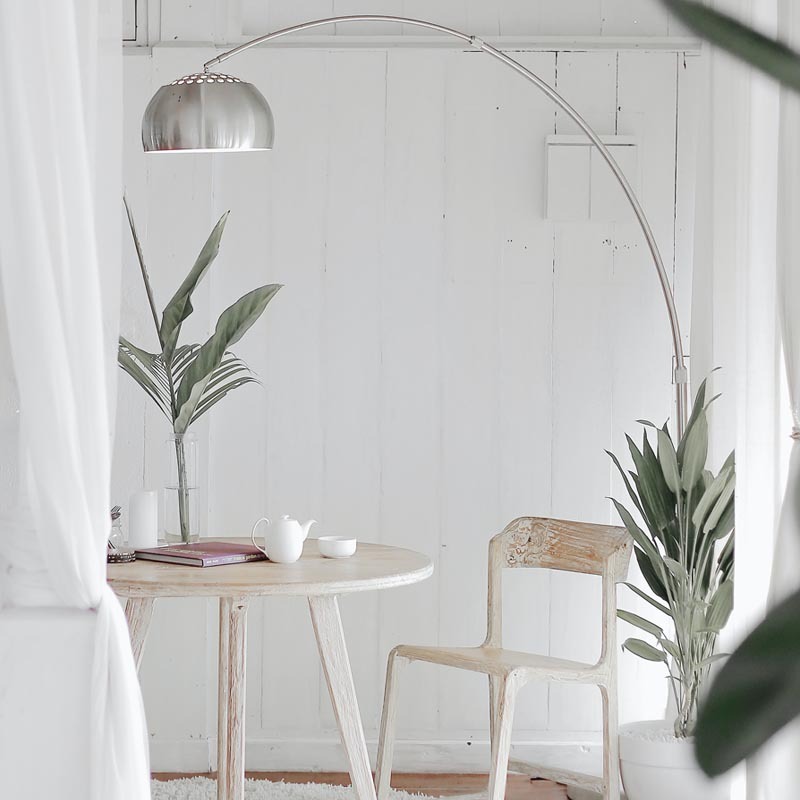
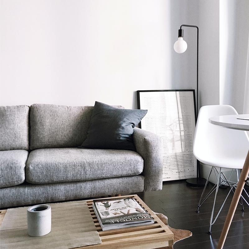
Hover or tap the image to see the ‘before’ colouring shot

Reliable, professional & affordable cleaning
For the purposes of this demo I created an imaginary business. From past experience of working with a similar business, the struggle is more about recruiting cleaners rather than attracting customers. I wanted to give the website a clean, modern, high-end look to help shrug off the dated image of what a cleaner might represent and to make the proposition of working as a cleaner more appealing and less stigmatised.
Obviously this is not a full website, and I haven't worked on the UX/navigation structure (the content is just a series of blocks for design purposes rather than logically ordered information). It was originally built as a training exercise to give the viewer an idea of how I would style a simple client site.
Hover or tap the image to see the ‘before’ colouring shot
Hover or tap the image to see the ‘before’ colouring shot
Hover or tap the image to see the ‘before’ colouring shot
Hover or tap the image to see the ‘before’ colouring shot
This block contains royalty-free stock photos that I sourced online. I think it's so important to have a consistent photographic style running through a website. For this demo I've re-coloured areas of the images in green to tie the colour scheme together. I really enjoy curating images!
I work as a freelance copywriter and I was spending all my time at a desk. Adding in a few hours of cleaning work each week is like a gym membership for me – and I get paid for it too! I've never felt fitter and I enjoy getting out and meeting new people.

I can honestly say that cleaning with Broom & Sprig is one of the best decisions I've ever made. It's such a flexible way of working and fits in around the rest of my week.

My cleaning clients are lovely – it's so nice to feel so appreciated! I love the feeling I get when I leave a client's house and it looks transformed! It's so much more enjoyable than cleaning my own house!

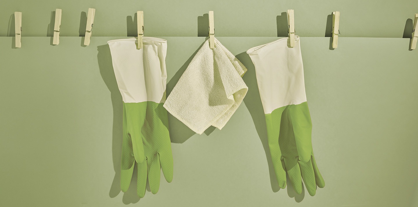
This image was sourced from a stock library, but I wanted to use it as a letterbox-shaped ‘hero’ image and it was in portrait mode. It was altered to a landscape format using Adobe generative AI, then edited, masked and re-coloured in Photoshop.
“Just because you CAN do it, doesn't mean that you necessarily SHOULD.”
“Don't use a sledgehammer to crack a nut.”
This demo has been built as a single hand-coded page – semantic HTML, modern CSS (custom properties, grid, masks) and a small amount of vanilla JavaScript for the carousel, gallery lightbox, hotspot, scroll effects and entrance animations. Graphics were done in Photoshop and Illustrator, with some additional icon sketching in Procreate for iPad using an Apple Pencil.
I've worked hard at optimising the images – finding the sweet spot between good image quality and fast download speeds. I've also spent time making sure that the formatting and layout is consistent and even across desktop, tablet and mobile.
Loads of things could still be improved – I could go on fiddling with it forever, but ultimately it's a demo.
The original hero used a self-hosted stock mp4, compressed from 29MB to around 3MB with Handbrake. I was aware that video in the hero bar slows the page down, so I'd consider switching it off on mobile.
I checked page performance using Google PageSpeed Insights and GTmetrix, and used the results to tweak image sizes and usability settings. Rebuilding by hand removes the dozens of builder scripts and stylesheets the page used to load, which is the biggest performance win of all. [NB: Video has since been removed from header]
It was fun to have the creative freedom of an imaginary brand.
The logo was designed from scratch in Illustrator. I started off sketching a leaf sprig and a broom in Procreate (which led me to the name Broom & Sprig) but these elements were abandoned in favour of a stylised ampersand in the end. I chose Playfair and Raleway as a font pairing as they provide a nice contrast and work well together. Playfair has a beautiful ampersand, hence its use in the logo. I used the brush-stroke textures from my original Procreate sprig sketch and overlaid them on the ampersand. This means this version of the logo isn't strictly scalable/vector (the overlay is raster), so for a real-world brand I would develop a flat-colour version of the ampersand (or add the textures in Illustrator instead).
I played around with using the ampersand symbol (converted to SVG) within the page, incorporating it in the dividers and as a subtle backdrop for the photo gallery.
I used Adobe Color to come up with ideas for the palette. I was aiming for a ‘Scandi-style’, clean, organic palette which I thought would appeal to the target audience.

I had so many ideas on ways to extend the functionality of the demo while building it:
Obviously the demo doesn't include all the content you would include on a full working website (e.g. full service descriptions, sign-up forms, about us, price guide, calls to action).